ISINA Design Library
A reusable Figma library for building consistent screens—accelerated by AI, guided by human design judgment.
Role
Head of Design,
Hands-on
Scope
Component design, AI direction, documentation
Timeline
One week
Core library foundations

The Challenge & Breakthrough
ISINA is a music platform that helps artists grow and enables fans to support them.
ISINA needed a practical library for building new screens and continuing the work across designers. My early experiments with AI produced standalone frames that often ignored existing components and tokens, adding more to maintain.
Connecting Claude to Figma through MCP let it work directly with the library’s components, properties, and tokens.
I could give it context, inspect what it built, and explain corrections in the same workspace where I designed the product.
01
Map
ChatGPT
Compare product screens.
Find repeated UI.
02
Decide
My role
Choose components, patterns,
and the scope of work.
03
Build
Claude + Figma MCP
Create variants and properties.
Reuse existing tokens.
04
Review
My role
Try it in real screens.
Correct, simplify, document.
The Decisions Behind the System
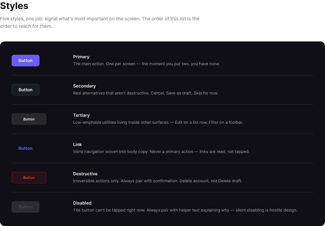
Consolidated button treatments.
I brought inconsistent button treatments into a reusable set, rather than preserving every visual variation as a separate component.
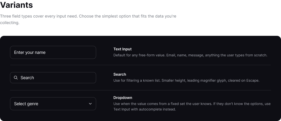
Simplified variants and properties.
I reviewed the AI-generated component structure and simplified variants and properties where they made the library harder to use. The goal was a practical system, not a larger catalog.
Corrected token reuse in real screens.
I checked the output in product screens and corrected places where it did not reuse existing tokens. This kept the build connected to the library’s foundations instead of adding more standalone UI to maintain.


Library components applied across authentication, uploads, and genre selection.
Built for the Next Designer
Usage guidance explains anatomy, variants, states, and how to combine components into patterns. I also prepared implementation metadata to help engineers translate the library into code.






The Results
10+ base components
Supported by reusable variants and usage documentation.
≈90% of new screens
New screens using library components following rollout. Based on my estimate at the time, not a formal adoption audit.
1 week
Actual time spent building, reviewing, and documenting the library with AI support.
What Made the Difference
The breakthrough wasn’t generating more UI. It was giving AI access to the existing system and reviewing its output in context. AI accelerated the build; my role was to decide what belonged, simplify the structure, and make the library usable by others.
Next Case
Webinar Platform
Live onboarding that built trust, halved drop-off, and boosted client commitment.